History of Design: Russian Constructivism Propaganda
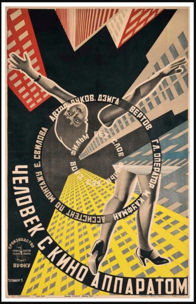
Russian Constructivist Propaganda was an art movement born of the revolution in the early 20th century Russia. The socialists needed a way to awaken the masses into getting behind the revolution & the new regimes’ goals, heavy focused around industrialist ideas.
They borrowed ideas from the Dadaists & the “Words in Freedom” movements, and created ‘call to action’ propaganda posters that could be understood by the vast majority of the country’s population, most of whom were illiterate farmers.

The key elements were large imagery, clipart style black & white images, and freeform flowing text. The images carried the weight of the message, the text being supplemental. Minimal color palettes, which always included black, white, and red, were put to extensive use due to their availability from printing presses.
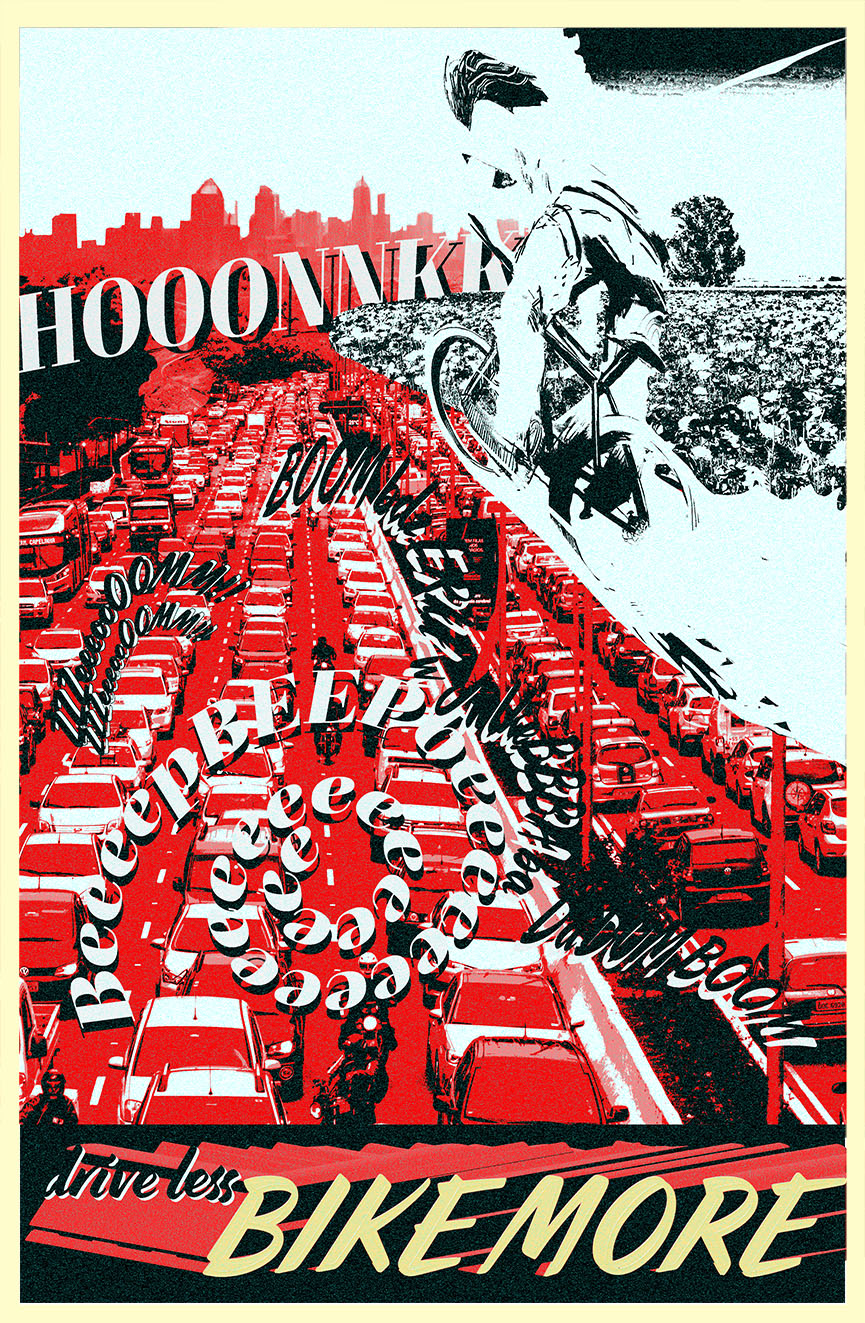
For my take on the art style, I started by choosing a specific call to action, in this case using bicycles instead of cars. I wanted to contrast the image of a cyclist against a highway full of cars in a traffic jam, with a distant large city skyline on the horizon. The poster would have split tones, where the traffic & city would be red to suggest the negativity of the congestion & polution, and the rider & field of flowers would be white to symbolize the purity.

Adding some of my own onomatopoeias (honk, beep, zoom, etc.) I was able to lay down typography in an interesting way to add to the chaotic feeling of the scene. Finishing with the call to action, it’s a specific message that people will understand & be able to act upon, and also plays into the duality of the scene by calling attention to both the unwanted & desired behavior.


